

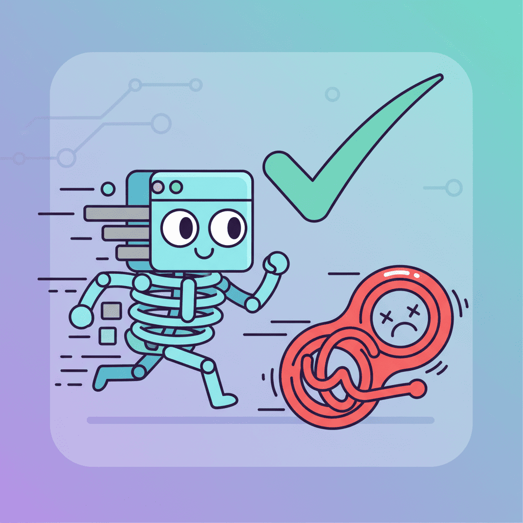
Your loading spinner is lying to users. It says "something's happening" but gives zero indication of what they're about to see. Meanwhile, skeleton loaders—those gray placeholder shapes that mimic your actual content—tell users exactly what's coming. And honestly? This is the UX detail that separates amateur apps from apps people actually trust.
I switched 6 client projects from spinners to skeleton loaders last quarter. Average time-on-page went up. Perceived load times went down. Users stopped rage-clicking refresh. AI skeleton loading prompts made this transformation take hours instead of weeks.
Key Takeaways:
- Skeleton loaders reduce perceived load time by up to 40% compared to spinners
- The best prompts specify exact content shapes, not just "add loading state"
- Shimmer animations are a one-liner addition that makes skeletons feel alive
- Match your skeleton to your final content layout or you'll confuse users
In This Article
- Why Skeleton Loaders Beat Spinners
- The 100ms Rule You're Probably Ignoring
- Basic Skeleton Prompts That Work First Try
- Shimmer Animation Prompts
- Complex Skeleton Layouts
- Component-Specific Skeleton Prompts
- Common Mistakes That Ruin Skeleton Loaders
- FAQ
Why Skeleton Loaders Beat Spinners
Here's what nobody tells you about loading states: users don't hate waiting. They hate uncertainty.
A spinner says "please hold." A skeleton loader says "here's exactly what's coming, and it's almost ready." That mental preview reduces anxiety and makes the wait feel shorter—even when it's the same duration.
| Loading Pattern | User Perception | Best For |
|---|---|---|
| Spinner | "Something's happening..." | Quick operations (<500ms) |
| Skeleton | "I see what's loading" | Content-heavy pages |
| Progress Bar | "X% complete" | File uploads, multi-step |
| Shimmer Skeleton | "Content is actively loading" | Lists, feeds, dashboards |
The research backs this up. Studies consistently show skeleton screens reduce perceived load time by 10-40% depending on implementation. That's not faster loading—that's faster feeling.
And here's my hot take: if your AI-generated UI doesn't include loading states, it's not production-ready. Period. Yet most tutorials skip this entirely. They show you how to build the component but leave you hanging when it comes to the UX details that actually matter.
The 100ms Rule You're Probably Ignoring
There's a UX principle that changed how I think about loading states: the 100ms threshold.
- Under 100ms: No loading indicator needed. Users perceive this as instant.
- 100ms - 1 second: Show a skeleton immediately. Don't wait.
- Over 1 second: Skeleton plus some indication of progress.
Most developers make this mistake: they add loading states after users complain. By then, you've already trained users that your app is slow.
The fix? Generate skeletons alongside your components from day one. And that's where AI skeleton loading prompts come in clutch.
Basic Skeleton Prompts That Work First Try
Let me save you the trial-and-error. After testing dozens of approaches, here's what actually generates usable skeleton loaders:
The Foundation Prompt
Create a skeleton loading component for [COMPONENT TYPE] with:
- Gray placeholder shapes matching the final content layout
- Rounded corners (8px) for a modern look
- Pulse animation using Tailwind's animate-pulse
- Same dimensions as the actual content to prevent layout shift
Want to try this yourself?
Notice what I included: specific visual specs and layout shift prevention. That last part is crucial. Nothing ruins a skeleton loader faster than the content jumping around when it finally loads.
Card Skeleton Prompt
Generate a React skeleton loader for a product card with:
- 200x200px image placeholder (rounded-lg, bg-gray-200)
- Two lines of text placeholder for title (different widths: 80% and 60%)
- Price placeholder (short, aligned left)
- Add to cart button placeholder (full width)
Use Tailwind CSS and animate-pulse for subtle animation
This generates something you can actually ship. The key details:
- Different line widths prevent the skeleton from looking like a gray rectangle
- Specific dimensions match real content proportions
- Placeholder hierarchies (title bigger than price) maintain visual rhythm
Text Block Skeleton
Build a skeleton loader for a blog post preview:
- Title: h2-sized placeholder, 70% width
- Meta line: small placeholder showing author/date area, 40% width
- Excerpt: 3 lines of body text placeholders, varying widths (100%, 95%, 70%)
- Consistent spacing matching actual typography
Tailwind CSS, React functional component
Pro tip: Always vary line widths. Real text doesn't end at the same point on every line. Your skeleton shouldn't either.
Shimmer Animation Prompts
Pulse animations are fine. Shimmer animations are better.
The shimmer effect—that left-to-right gradient sweep—tells users "content is actively loading" rather than "the page might be frozen." It's a small detail with outsized impact.
Basic Shimmer Prompt
Create a shimmer effect skeleton component in React with:
- Base gray background (bg-gray-200)
- Animated gradient overlay that sweeps left to right
- Use CSS keyframes: translateX from -100% to 100%
- 1.5 second animation duration, infinite loop
- Apply to a card skeleton with image, title, and description placeholders
Want to try this yourself?
Reusable Shimmer Component
Here's a more production-ready approach:
Build a reusable Shimmer skeleton system in React + Tailwind:

1. Base Shimmer component that accepts className for sizing
2. Skeleton.Text - line of text, customizable width
3. Skeleton.Circle - avatar placeholder, customizable size
4. Skeleton.Rectangle - image/card placeholder, customizable dimensions

Include the CSS keyframe animation and a usage example showing
a user profile skeleton with avatar, name, and bio.
This gives you a component library instead of one-off solutions. Much cleaner for maintaining consistency across your app.
Complex Skeleton Layouts
Here's where most AI-generated skeletons fall apart: complex layouts. A card skeleton is easy. A dashboard with multiple data types? That's where you need specific prompts.
Dashboard Skeleton
Generate a dashboard skeleton layout with:

Left sidebar (w-64):
- Logo placeholder
- 5 navigation item placeholders with icons

Main content area:
- Header with page title and user avatar placeholders
- Stats row: 4 metric cards with icon, number, and label placeholders
- Chart area: large rectangle placeholder (h-64)
- Table area: header row + 5 data row placeholders

Use Tailwind CSS, all elements have animate-pulse
Wrap in a React component with grid/flex layout
If you're building dashboards, check out our AI dashboard prompts guide for the actual content components.
List/Feed Skeleton
Create a skeleton for a social feed with 5 post items:

Each post skeleton includes:
- Avatar circle (40x40px) on the left
- Header: username line (30% width) and timestamp (15% width)
- Content: 2-3 lines of text placeholders
- Footer: 3 action button placeholders inline

Use gap-4 between items, consistent padding
React + Tailwind, include the parent container
The trick with lists is consistency. Every item should be identical. Users scan patterns—inconsistent skeletons break that mental model.
Data Table Skeleton
For tables, you need to think differently. Don't just create gray rectangles—match the column structure:
Build a data table skeleton with:
- Table header: 5 columns with different widths (checkbox 40px, name 200px, email 250px, role 100px, actions 80px)
- 8 data rows with placeholders matching header widths
- Subtle row hover states (bg-gray-50)
- Animate-pulse on all placeholder elements
- Use proper table HTML semantics (thead, tbody, tr, td)
This pairs well with our AI data table prompts tutorial when you're building the full component.
Component-Specific Skeleton Prompts
Different components need different skeleton strategies. Here's my cheat sheet:
Form Skeleton
Create a form skeleton for a contact form:
- Label placeholders (short, above each field)
- Input field placeholders (full width, h-10, rounded)
- Textarea placeholder (full width, h-32)
- Submit button placeholder (w-32, right-aligned)
Spacing consistent with actual form layout
Forms are tricky because they have so many small elements. The key is maintaining the visual rhythm between labels and inputs.
Profile/User Card Skeleton
Generate a user profile skeleton:
- Large avatar circle (96x96px) centered
- Name placeholder (40% width, centered, h-6)
- Title/role placeholder (25% width, centered, h-4)
- Stats row: 3 items with number and label placeholders
- Bio: 3 lines of text, varying widths
- Action buttons row: 2 button placeholders
E-commerce Product Grid
Build a product grid skeleton (2x3 grid on desktop):

Each product skeleton:
- Image placeholder (aspect-square, rounded-lg)
- Brand name (20% width, small text)
- Product title (2 lines, 90% and 60% width)
- Price placeholder with strikethrough for sale items
- Rating placeholder (5 small circles in a row)

Include responsive behavior: 1 column mobile, 2 columns tablet, 3 columns desktop
For full e-commerce UIs, see our e-commerce UI prompts guide.
Progressive Loading: Beyond Basic Skeletons
Sometimes a skeleton isn't enough. For content-heavy pages, consider progressive loading:
Here's the prompt for this pattern:
Create a progressive loading component with 3 states:

1. Skeleton state: Gray placeholders with shimmer
2. Blur state: Low-res image with blur-lg filter
3. Loaded state: Full resolution, blur transition out

Use React useState for state management
Include 300ms transition between blur and loaded states
Apply to an image card component
This is particularly effective for image-heavy content. Users see something immediately, which buys you time to load the full asset.
Common Mistakes That Ruin Skeleton Loaders
I've seen these kill the UX improvement skeletons are supposed to provide:
Mistake 1: Skeleton Doesn't Match Content Layout
Bad: Square skeleton for a wide rectangular image Good: Skeleton with exact aspect ratio of the final image
Your skeleton should be a 1:1 preview of the structure. If users expect a card based on the skeleton, they should get a card—not a completely different layout.
Mistake 2: Uniform Line Widths
Bad: Three identical gray lines Good: Lines at 100%, 80%, and 50% widths
Real text has natural variation. Uniform skeletons look robotic and don't set accurate expectations.
Mistake 3: Forgetting Layout Shift (CLS)
Bad: Skeleton that's 200px, content that's 350px Good: Skeleton reserves exact space for content
Layout shift is a Core Web Vitals metric. It also makes users feel like your app is unstable. Always match dimensions.
Mistake 4: Too Slow Animation
Bad: 5-second pulse animation Good: 1.5-2 second animation cycle
Slow animations feel like the app is struggling. Fast animations feel active and responsive.
Mistake 5: No Skeleton At All
Bad: Blank white space while loading Good: Skeleton from first paint
If you're reading this and your app has blank loading states, fix that first. Anything is better than nothing.
How to Add Skeletons to Existing Components
Got components that need loading states? Here's the upgrade prompt:
I have an existing [COMPONENT NAME] that currently shows [CURRENT LOADING BEHAVIOR].

Add a skeleton loading state that:
1. Shows when isLoading prop is true
2. Matches the exact layout of the loaded state
3. Uses animate-pulse for subtle animation
4. Transitions smoothly to content when loaded (opacity-100 from opacity-0)

Preserve all existing functionality.
This is vibe coding at its best—you describe the before state, the desired state, and let AI handle the implementation. Just make sure to test that the "preserve all existing functionality" part actually happened.
If you run into issues, our guide on fixing AI-generated code errors covers the debugging process.
Performance Considerations
Skeletons improve perceived performance, but they shouldn't hurt actual performance:
| Do | Don't |
|---|---|
| Use CSS animations (GPU-accelerated) | Use JavaScript-driven animations |
| Lazy load skeleton component | Bundle with main content |
Use content-visibility: auto | Render 100 skeleton items |
| Match skeleton count to expected items | Over-estimate and re-render |
The sweet spot for list skeletons: show enough to fill the viewport, then lazy load more as needed. 5-8 items is usually right.
Putting It All Together
Here's a comprehensive prompt that generates a production-ready skeleton system:
Build a complete skeleton loading system for a React app:

1. SkeletonProvider component with dark mode support
2. Skeleton.Line - text placeholder, accepts width prop
3. Skeleton.Circle - avatar/icon placeholder, accepts size prop
4. Skeleton.Rectangle - image/card placeholder, accepts width/height
5. Skeleton.Card - pre-built card skeleton with image, title, description
6. Skeleton.List - renders n skeleton items with consistent gap

Include:
- Shimmer animation using CSS keyframes
- Dark mode variants (gray-700 instead of gray-200)
- TypeScript types for all props
- Usage example showing a user profile loading state
Want to try this yourself?
This gives you a reusable system instead of generating one-off skeletons for every component. Much better for consistency and maintainability.
For more prompt templates across all UI components, check out our complete AI UI prompts collection.
You Might Also Like
- AI Animation Prompts: Micro-interactions That Work - Master hover effects, transitions, and the shimmer animations mentioned here
- AI Dashboard Prompts: 40+ Templates - Dashboard skeletons pair perfectly with these dashboard prompts
- Fix AI-Generated Code Errors (Actually Works) - When your skeleton doesn't render right
Frequently Asked Questions
What are AI skeleton loading prompts?
AI skeleton loading prompts are natural language descriptions that tell AI code generators how to create skeleton loading components—the gray placeholder shapes that appear while content loads. Good prompts specify exact dimensions, animation types, and layout structures to generate production-ready loaders.
Should I use skeleton loaders or spinners?
Use skeleton loaders for content-heavy pages where users benefit from seeing the layout structure. Use spinners for quick operations under 500ms or when you can't predict the content layout. Skeletons reduce perceived load time by 10-40% because they set expectations about what's coming.
How do I add shimmer effects to AI-generated skeletons?
Include "shimmer animation using CSS keyframes" in your prompt and specify the animation should sweep left to right with a 1.5-2 second duration. Request a gradient overlay that moves using translateX from -100% to 100% for the classic shimmer effect.
Do skeleton loaders affect Core Web Vitals?
Yes, positively—if implemented correctly. Skeletons that match your content dimensions prevent Cumulative Layout Shift (CLS). Use CSS animations (GPU-accelerated) rather than JavaScript animations to avoid impacting Interaction to Next Paint (INP). Properly sized skeletons can improve your CLS score significantly.
How many skeleton items should I show in a list?
Show enough to fill the viewport—typically 5-8 items. Rendering too many wastes resources; rendering too few looks incomplete. For infinite scroll lists, render skeleton items equal to your page size or viewport capacity, whichever is smaller.
Written by the 0xMinds Team. We build AI tools for frontend developers. Try 0xMinds free →