
Let me be straight with you: the traditional landing page workflow is broken.
You've got an idea. Maybe it's a SaaS product, a freelance service, or a weekend side project. And what do most guides tell you? "First, open Figma. Create a wireframe. Then mockup. Then high-fidelity. Then export. Then code." Three days later, you're still adjusting kerning on a headline nobody will read.
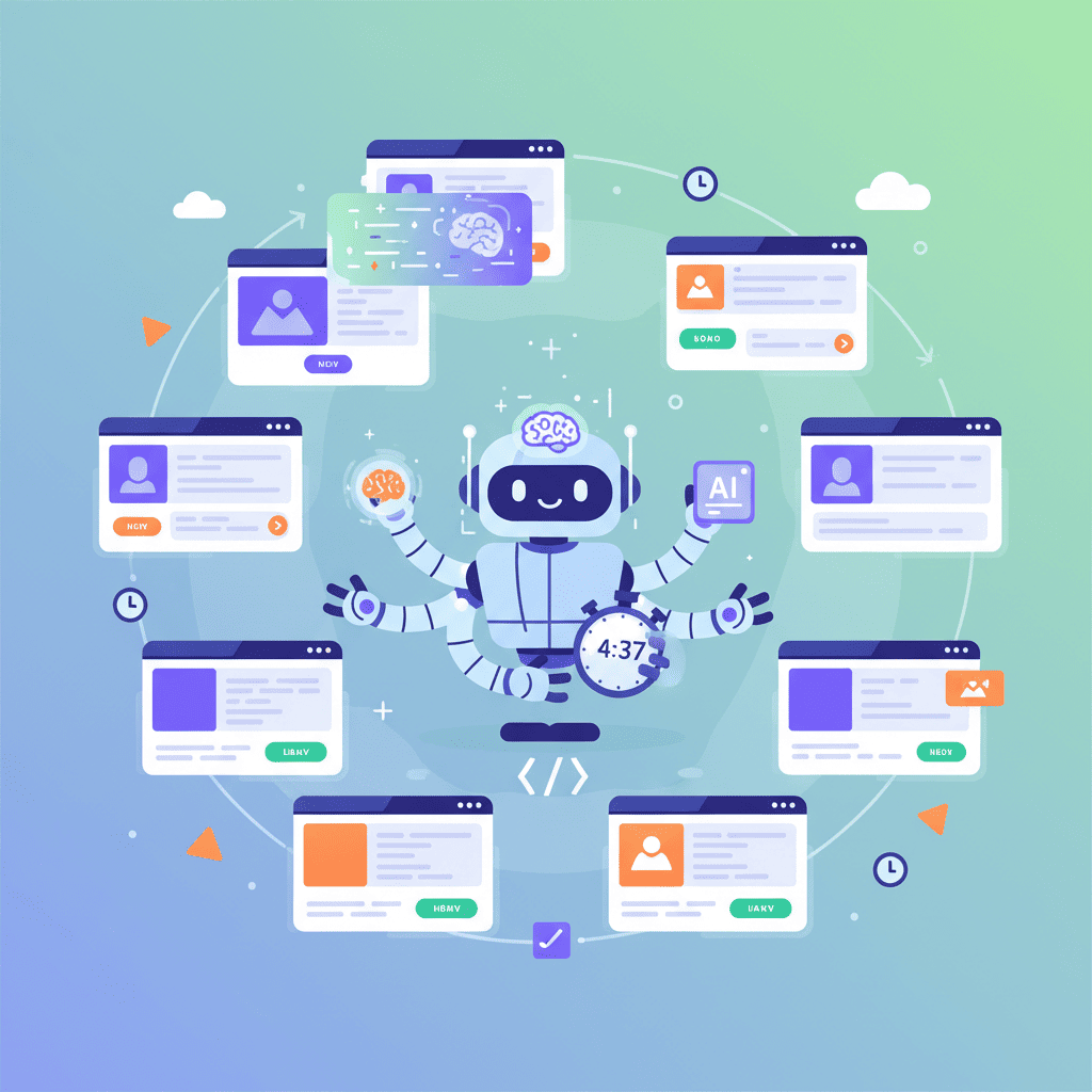
I've built over 40 landing pages with AI in the past six months. The ones that actually converted? I spent under 5 minutes on each. The ones I agonized over in design tools? Mostly abandoned in a folder called "landing-page-final-v3-FINAL."
Here's the thing nobody tells you about using an AI landing page builder: speed isn't about cutting corners—it's about building momentum. When you can go from idea to live page in minutes, you actually ship. You test. You iterate. That's where the magic happens.
Key Takeaways:
- Build a complete landing page in under 5 minutes using a prompt-first workflow
- No design tools needed—describe what you want, get production-ready code
- Master the 4-section structure that converts: Hero → Features → Social Proof → CTA
In This Article
- The 5-Minute Framework
- Step 1: Hero Section (60 seconds)
- Step 2: Features Section (90 seconds)
- Step 3: Social Proof (60 seconds)
- Step 4: CTA Section (60 seconds)
- Step 5: Polish & Responsive (60 seconds)
- Copy-Paste Prompt Templates
- FAQ
What We're Building: The Final Result
Before we dive in, let's be clear about what "5 minutes" actually gets you:
| Section | Time | What You Get |
|---|---|---|
| Hero | 60 sec | Headline, subheadline, CTA button, optional hero image |
| Features | 90 sec | 3-4 benefit cards with icons and descriptions |
| Social Proof | 60 sec | Testimonials or trust badges |
| Final CTA | 60 sec | Converting the hesitant visitor |
| Polish | 60 sec | Mobile responsive check, minor tweaks |
That's a complete, conversion-optimized landing page. Not a wireframe. Not a "starting point." An actual page you can deploy.
And honestly? The 5-minute claim is conservative. Once you've done this three or four times, you'll be closer to 3 minutes.
The 5-Minute Framework: Your Prompt Strategy
Here's where most people mess up: they try to generate an entire landing page in one prompt.
Don't do that.
The AI gets confused. It makes weird decisions about hierarchy. Half your sections look like they belong on different websites. I learned this the hard way after generating approximately 47 unusable pages.
The fix is embarrassingly simple: build section by section.
Each section gets its own prompt. Each prompt builds on the last. You're not just generating—you're directing. This is the difference between using AI and actually being good at it.
The mindset shift: you're the creative director, not the pixel pusher. You decide what goes where. The AI handles the execution.
Let's build something real.
Step 1: Hero Section (60 Seconds)
The hero is where 90% of landing pages fail. Too much text. Unclear value prop. Generic stock photos. You've seen them—those "Welcome to our innovative solution that leverages synergy" disasters.
Your hero needs three things:
- Headline: What do you do? (7 words or less)
- Subheadline: Why should I care? (One sentence)
- CTA: What's the next step?
Here's the prompt structure that works:
Create a hero section for [product type].
Headline: [your headline]
Subheadline: [one sentence explaining the benefit]
Primary CTA button: [button text]
Style: Modern, clean, centered layout with subtle gradient background.
Use Tailwind CSS.
Real example:
Create a hero section for a project management tool.
Headline: Ship Projects, Not Excuses
Subheadline: The dead-simple project tracker that teams actually use.
Primary CTA button: Start Free Trial
Style: Modern, clean, centered layout with subtle gradient background from indigo-50 to white.
Use Tailwind CSS and React.
I've tested dozens of variations. This structure works because it gives the AI clear constraints without micromanaging. The AI can't mess up the hierarchy if you've already defined it.
Want to try this yourself?
Pro tip: Skip the hero image on first generation. Add it in the polish phase if needed. Images slow down your AI workflow and often look generic anyway.
Step 2: Features Section (90 Seconds)
This is where you sell the "how." Your hero got attention. Now you need to answer: "Okay, but what does this actually do for me?"
The magic number is 3-4 features. More than that and you dilute the message. Fewer and you look incomplete.
Here's the prompt structure:
Create a features section with 4 benefit cards.
Product: [your product]
Features:
1. [Feature name] - [One sentence benefit]
2. [Feature name] - [One sentence benefit]
3. [Feature name] - [One sentence benefit]
4. [Feature name] - [One sentence benefit]
Style: 2x2 grid on desktop, stacked on mobile. Each card has an icon, title, and description.
Use Tailwind CSS, Lucide icons for React.
Real example:
Create a features section with 4 benefit cards.
Product: Project management tool for remote teams
Features:
1. Real-time Sync - See changes instantly across all devices
2. Smart Deadlines - AI-powered scheduling that accounts for dependencies
3. Team Pulse - Know who's blocked before they tell you
4. One-Click Reports - Generate client-ready updates in seconds
Style: 2x2 grid on desktop, stacked on mobile. Each card has an icon, title, and description.
Use Tailwind CSS, Lucide icons for React.
The key insight here: benefits, not features. "Real-time Sync" is a feature. "See changes instantly across all devices" is the benefit. Always lead with what the user gets.
Want to try this yourself?
Step 3: Social Proof Section (60 Seconds)
Here's my hot take: testimonials matter more than your features section.
People trust people. That fancy feature list? Cool. But "This tool saved our team 10 hours a week" from a real person? That converts.
If you don't have testimonials yet (new product, no beta users), use trust indicators instead: "Used by teams at [company logos]" or "500+ projects managed" or even "Backed by Y Combinator" if applicable.
Prompt structure for testimonials:
Create a testimonials section with 3 customer quotes.
Style: Horizontal cards with avatar placeholder, name, role, company, and quote.
Include star ratings (5 stars).
Background: Light gray or subtle pattern.
Use Tailwind CSS.

Testimonial 1: [Quote] - [Name], [Role] at [Company]
Testimonial 2: [Quote] - [Name], [Role] at [Company]
Testimonial 3: [Quote] - [Name], [Role] at [Company]
No real testimonials? Use this honest approach:
Create a trust indicators section.
Show: "Trusted by 500+ teams" as headline
Add logos placeholder row (6 placeholder logos in grayscale)
Add stat cards: "10k+ projects", "99.9% uptime", "4.8/5 rating"
Use Tailwind CSS.
I actually prefer the trust indicators approach for early-stage products. It feels more honest than made-up testimonials, and you can update it with real quotes as you get them.
Step 4: Final CTA Section (60 Seconds)
This is where you catch the hesitant visitor. They've scrolled through everything. They're interested but not convinced. This is your closing argument.
The best final CTAs do three things:
- Restate the core benefit
- Handle the biggest objection
- Make the action feel low-risk
Prompt structure:
Create a final CTA section.
Headline: [Restate core benefit]
Subtext: [Handle objection - like "No credit card required" or "14-day free trial"]
Primary button: [Main CTA]
Secondary button or text: [Lower-commitment option like "See demo" or "Read docs"]
Style: Centered, contrasting background color, prominent buttons.
Use Tailwind CSS.
Real example:
Create a final CTA section.
Headline: Ready to ship your next project?
Subtext: Start free. No credit card required. Cancel anytime.
Primary button: Get Started Free
Secondary button: Watch 2-min Demo
Style: Centered, dark background (slate-900), white text, prominent buttons.
Use Tailwind CSS and React.
That "No credit card required" kills more objections than any feature ever could. Don't skip the objection handling.
Step 5: Polish and Responsive Check (60 Seconds)
You've got four sections. Now we glue them together and make sure nothing's broken on mobile.
Here's the final prompt:
Combine these sections into a single landing page component:
1. [Hero section code]
2. [Features section code]
3. [Testimonials section code]
4. [Final CTA section code]

Add a simple navbar with logo text "ProductName" and a CTA button.
Add a minimal footer with copyright and links.
Ensure all sections are mobile responsive.
Use consistent spacing (py-16 or py-20 between sections).
Then—and this is crucial—actually resize your browser. Check tablet. Check mobile. AI usually gets responsiveness right with Tailwind, but weird things happen sometimes. Text overlapping. Buttons too small. Fix it now.
If something's off, don't regenerate the whole page. Just say:
The features grid breaks on mobile. Make the cards stack vertically on screens under 768px.
Targeted fixes. That's the vibe coding way.
Prompt Templates You Can Copy-Paste
Alright, here's the part you actually came for. Copy these, tweak the brackets, ship your page.
Complete Landing Page (One Prompt)
Once you understand the section-by-section approach, you can try the all-in-one for simpler pages:
Build a complete landing page for [product description].

Sections:
1. Hero: Headline "[your headline]", subheadline about [main benefit], CTA "[button text]"
2. Features: 3 cards showing [feature 1], [feature 2], [feature 3]
3. Social proof: Trust badges showing "[stat 1]", "[stat 2]", "[stat 3]"
4. Final CTA: Headline "Ready to [action]?", subtext "Free trial, no credit card required"

Include navbar with logo and footer with copyright.
Mobile responsive. Modern, clean design.
Use React with Tailwind CSS.
Want to try this yourself?
SaaS Landing Page Template
Create a SaaS landing page for [your SaaS product].
Target audience: [who uses this]
Main problem solved: [the pain point]

Include:
- Hero with headline, subheadline, email capture form
- 3 feature cards with icons
- Pricing section with 3 tiers (Free, Pro, Enterprise)
- FAQ section with 4 questions
- Footer with links

Style: Modern SaaS aesthetic, use Tailwind CSS and shadcn/ui components.
Product Launch Landing Page Template
Create a product launch landing page.
Product: [your product]
Launch date: [when]

Include:
- Hero with countdown timer, headline, email waitlist signup
- "What you'll get" section with 4 bullet points
- Founder quote or story section
- Early bird CTA with urgency ("Limited spots")

Style: Dark theme, modern tech startup vibe.
Use React with Tailwind CSS.
Common Mistakes That Slow You Down
I've made all of these. Learn from my pain:
-
Writing novel-length prompts: More words doesn't mean better output. AI gets confused past ~200 words. Be concise.
-
Not specifying the tech stack: "Make a landing page" gives you random CSS. "Use Tailwind CSS and React" gives you usable code.
-
Generating images in the first pass: Hero images slow everything down. Build the structure first, add images later if needed.
-
Regenerating entire pages: Something broke? Fix that one thing. Don't start over.
-
Skipping mobile check: Always. Check. Mobile. 83% of landing page traffic is mobile in 2026.
If you want to dive deeper into prompt mistakes and how to fix them, check out our guide on vibe coding mistakes and how to avoid them. It'll save you hours.
You Might Also Like
- AI Hero Section Prompts That Convert (25+ Templates) - Deep dive into hero sections with more advanced prompts
- Build a Startup Landing Page with AI - Comprehensive guide for startup-specific pages
- AI Pricing Table Prompts That Convert - Add pricing to your landing page that actually converts
Frequently Asked Questions
What is an AI landing page builder?
An AI landing page builder lets you create complete web pages by describing what you want in plain English. Instead of dragging and dropping elements or writing code from scratch, you write prompts like "Create a hero section with a signup form" and get production-ready React or HTML code in seconds.
Can I really build a landing page in 5 minutes with no design skills?
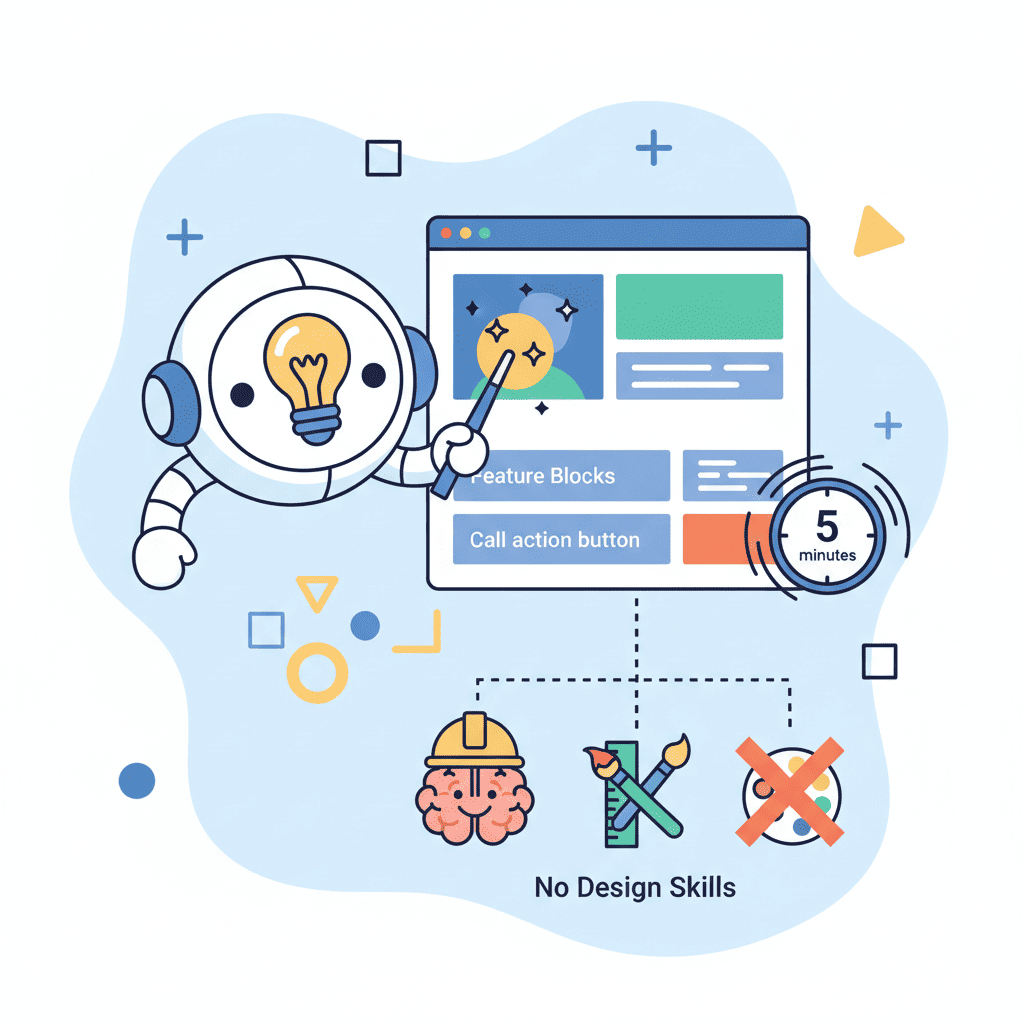
Yes—if you follow a section-by-section approach. The key is breaking the page into 4-5 manageable chunks (hero, features, social proof, CTA) rather than trying to generate everything at once. Each section takes about 60 seconds. The "no design skills" part works because the AI handles layout, spacing, and visual hierarchy.
What sections should every landing page have?
At minimum: Hero (headline + CTA), Features (3-4 benefits), Social Proof (testimonials or trust indicators), and Final CTA. This structure covers the full visitor journey from "what is this?" to "should I trust it?" to "I'm ready to try it."
Do AI landing pages convert well?
They convert as well as any landing page—the AI handles the implementation, but you still control the messaging. Pages that convert well have clear value propositions, handle objections, and have obvious CTAs. The AI gives you solid structure; your copy determines the conversion rate.
Should I use one prompt or multiple prompts for a landing page?
Start with multiple prompts (one per section) until you understand the patterns. This gives you more control and makes debugging easier. Once you're comfortable, you can move to single-prompt generation for simpler pages. The section-by-section approach typically produces more consistent results for beginners.
Written by the 0xMinds Team. We build AI tools for frontend developers. Try 0xMinds free →